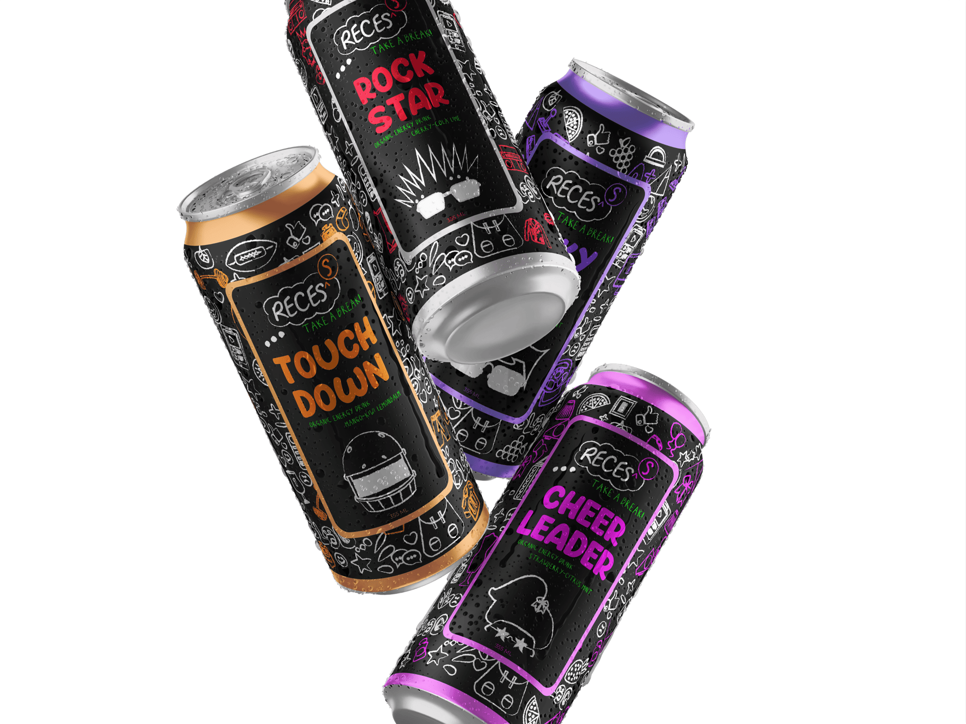
Recess
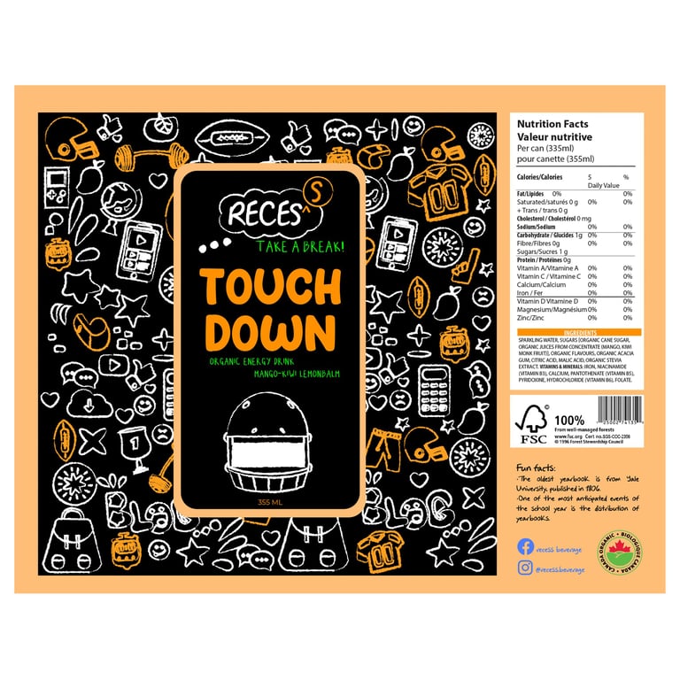
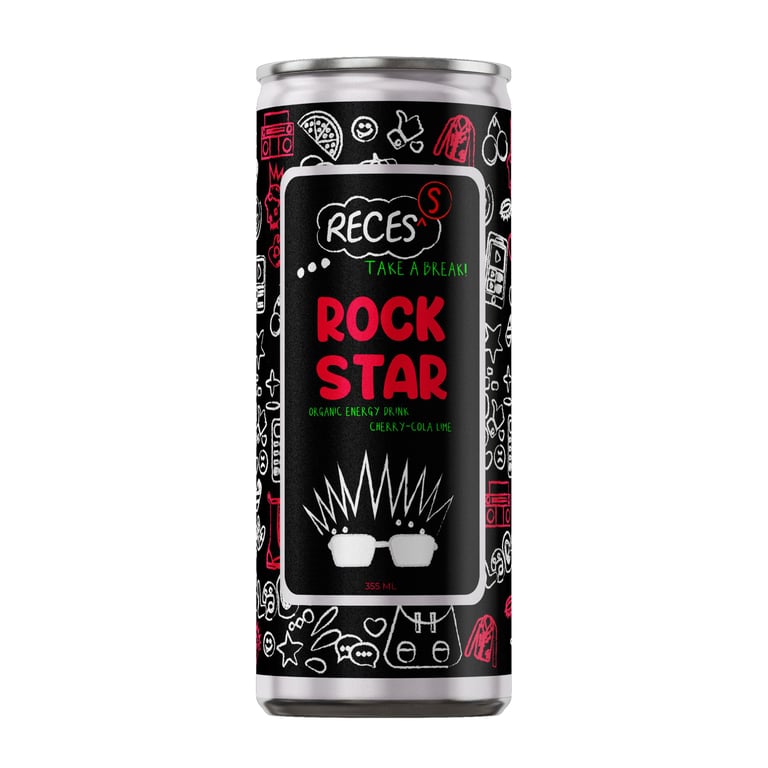
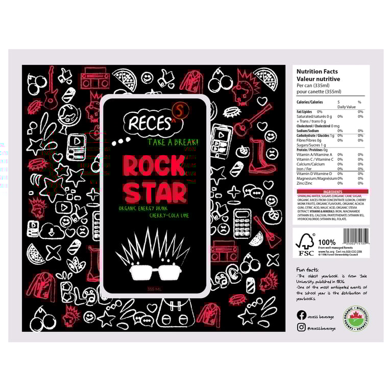
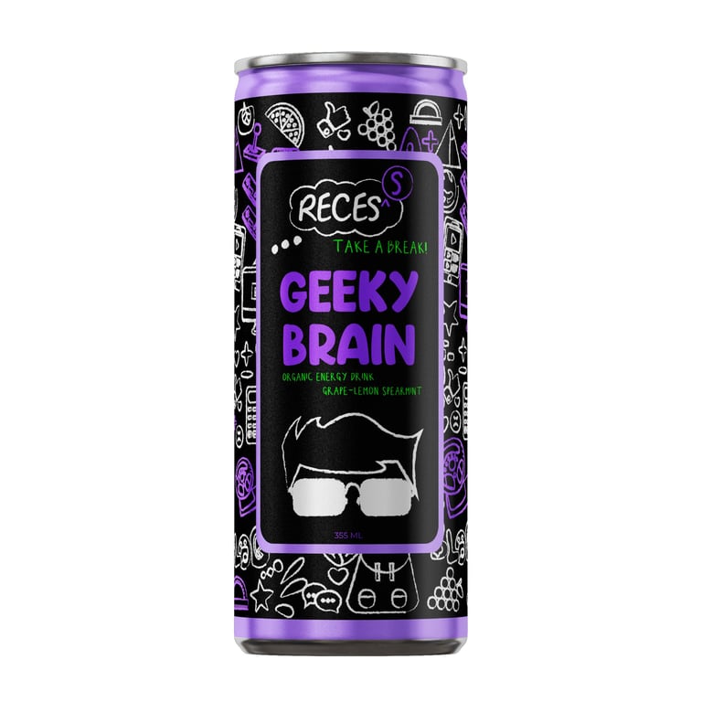
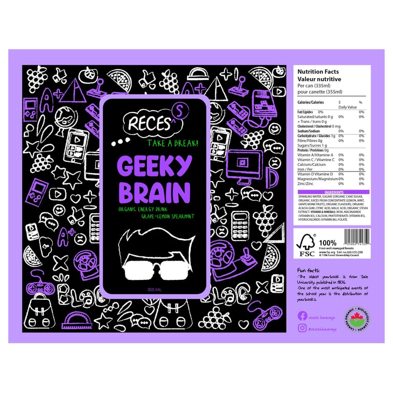
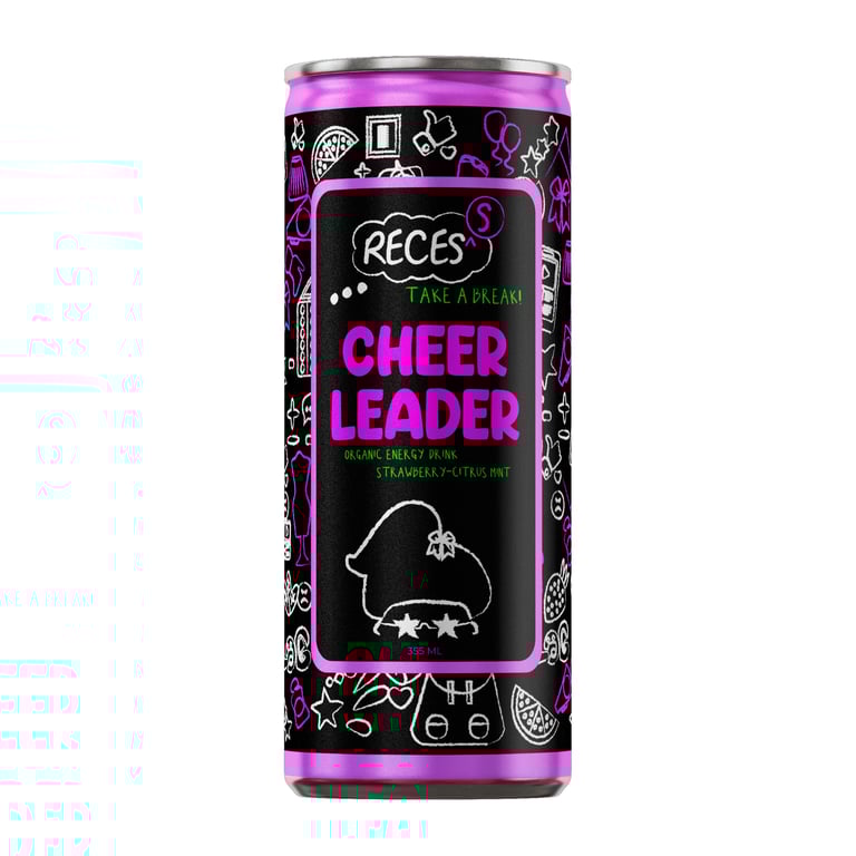
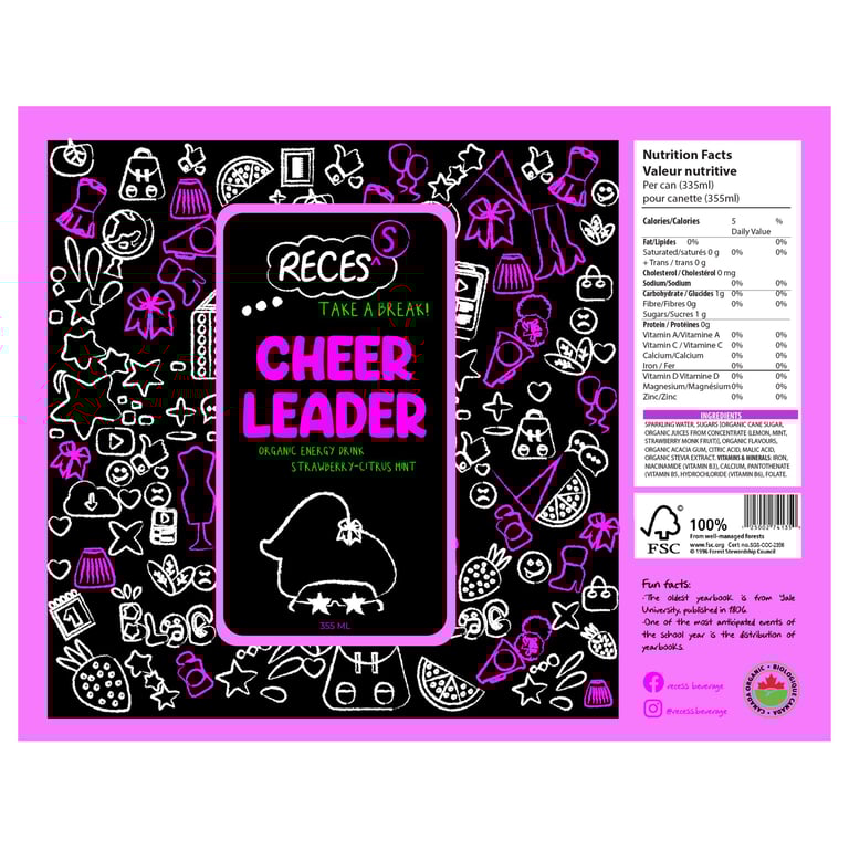
RECES’S are an organic and healthy energy drinks with natural and beneficial ingredients to provide energy to students, without the caffeine effects normally found in energy drinks.
TAKE A BREAK
The logo is formed by the word recess which is the most expected of the students when they are in school, also because it is the moment where they could enjoy or need energy.
It is misspelled on purpose to make more match with the concept of being in school as it is normal to find spelling mistakes.
Logo


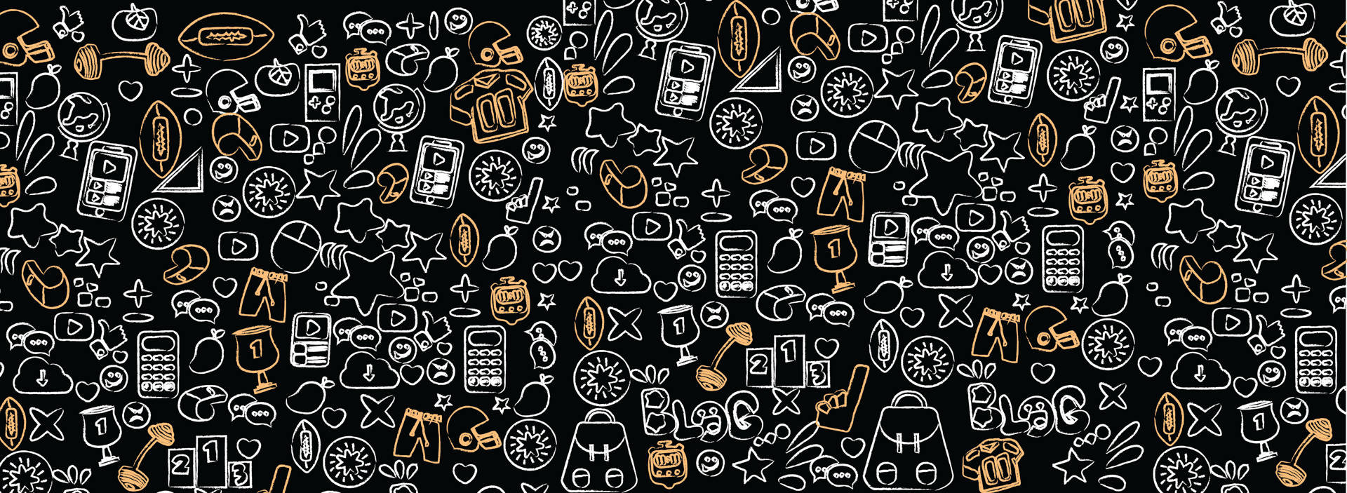
Packaging - Illustration
Design Elements
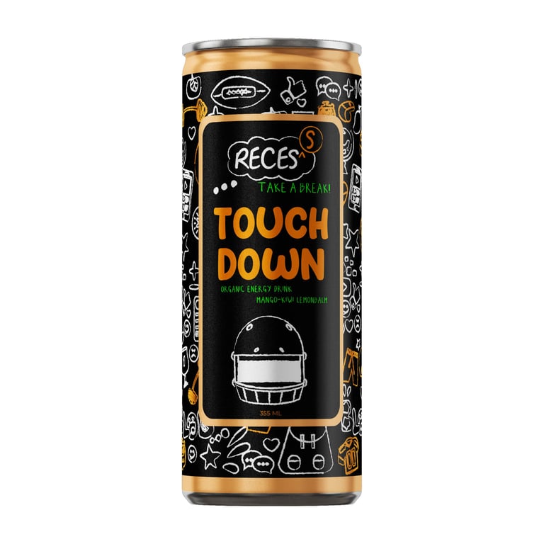
The design was based on students’ qualities and passions by creating a doodle-style pattern representing the chalkboard. Each drink has different doodles according to the related stereotype. A doodle style character and matching typography was also added to help further elevate the concept.
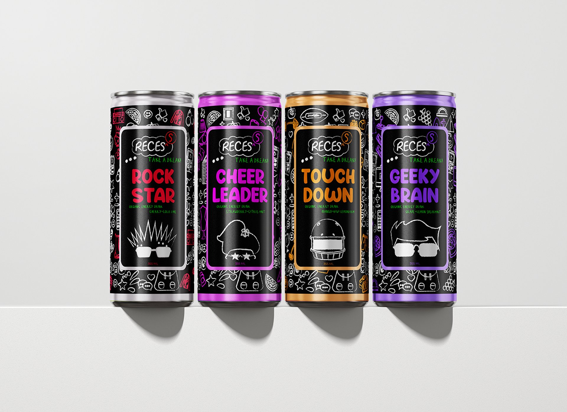
Tins Collection